Monday, 4 February 2013

Double Page Research v2


Above is the comparison between the front cover of an NME magazine and also the corresponding double page spread. As evident, the stance of the subjects in both photographs isn't hugely different - they are also all wearing the same clothes and instead of burning the magazine he is holding the burnt one. It follows the same colour scheme with the goldy text, a white background and black text also. The main article of text is evident on one side of the double page spread, with a huge Pull Quote situated in the middle of the article. There is a similar heading to the left of both the front cover and also the double page spread '60 years of NME' this helps to incorporate both of the pieces of media together to form a unified house style.

The font for the pull quotes on both the front cover and the double page spread are the same, the main article font is unique because text this small is not evident on the front page- it would not make sense to use this because it does not stand out to the reader.


2nd NME Front page and DPS


Above are the corresponding front page and double page spread for an edition of the NME magazine. They have specific design elements that help to show the reader they're from the same magazine. The picture is the first thing we see on both pieces of media because it is so bold and large. In both the front cover and the double page spread they are both wearing the same clothes but are situated in a different stance, while in the front cover it is a close up shot of the subjects faces, the double page spread it is a long shot capturing all 4 subjects. There is minimal text on the double page spread to the right in the slim and slightly translucent rectangle. A huge drop cap is used on the text to add to the design elements of the double page spread.


3rd NME Front Page and DPS


Above is another NME front page and double page spread from an edition of the magazine. Both pieces of media are from the same magazine but this time the double page spread is laid out differently, due to the title 'How it feels to spend 786 days on the road.' As you can see the double page spread is juxtaposed differently; there are a various amount of pictures from Muse's tour above and then a lot of sub headings below illustrating what they did; this is a unique double page spread and doesn't depict their usual style when creating a magazine double page spread. Although, they keep their unified house style by the use of the fonts and colours of fonts, like the cover only red white and black fonts are used on the double page spread.

4th NME Front Page and DPS


 Above are the matching front cover and double page spread from an  NME magazine. Although the two don't contain the same design elements across the two, the pictures help identify them together, they appear to be wearing the same clothes but in a very different stance. It is a great double page spread because of the eagle flying in the back, obviously I will  not have access to such a thing as this but I can try to make my picture as impressive as I can.

Friday, 25 January 2013

Contents Page first draft


Contents page Construction 2


     To the left I started a new document. Within this document I placed a black rectangle using the shape tool as situated below; I then adjusted it to whatever size I wanted. 


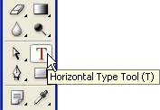
In addition to this I then added text to my rectangular banner I had just added; this was done using the text tool to the left.

Then I decided to add a picture from one of my photoshoots to my contents; It is situated here because it is similar to the layout of NME; same applies with the black and white. I simply dragged this image in from the computer


I then added the 'Refrain' Logo to the banner at the top; I extended the banner by drawing another rectangle using the same tool as before. The 'Refrain' text was added using the text tool but I added some effects to it. I used bevel and emboss, and also the gradient overlay; both these effects can be found on the drop out menu below.


 I then added my written mini article below the picture; this was done with the text tool as before, obviously with a bigger amount of text. I did create the T in the first word to be bigger though, because through my research into contents pages it is evident that the majority of all major magazines do this.

To give a design feel to my contents page I decided to use white rectangles to cover the bottom of my picture slightly so I could type across them. The rectangles were created using the rectangle tool and the text was created and edited using the text tool. (Both below)


Because before the top banner was too low down the page, I shifted it all up to the top to make it fulfil the page more. I also added a date below 'Refrain', I created another black rectangle so I could write over it in a white colouring; helps stick to the house style. The text was once again edited using the text tool.

After this I then began to add the banners to the right of my contents page. I started by using a black rectangle then writing 'NEWS' over it in a new font in white. I created an edited the text by using the Photoshop text tool. I also change the font of the 'this week' to add to the house style of my magazine.

I then began to add some of the page numbers into the different subheadings. I created the page number in a different text colour to match the 'Refrain' adding to the house style. The rest was then typed in a black font using the text tool.

I then continued to add the different sub headings and text to the contents page using the same tools as before.


After all of my sub headings and text were added to my contents page I decided to add a design element to the bottom right of my page. I created the 'ribbon' by adding a rectangle, then using a diamond to eliminate the left edge of the shape by turning it white. This created the ribbon effect. The text was formatted appropriately using the text tool to fit on top of this.


After this I made a separate 'CD Cover' on Photoshop. I used an original picture of mine to create an effective 'CD Cover' to give the reader an insight to 'the ultimate album of 2012'. I then imported this file by saving it as a jpeg image and simply dragging it into the contents page Photoshop file.


After completing my First Draft I decided to act on the faults which I found, below are the adjustments I made to my magazine Contents Page.


I have chosen to create a subscription bar down in the bottom of my contents; this is evident in the NME style magazines. So far I used the rectangle tool to create the box to which the information will go into. I then imported a .jpg image of my front cover and tilted it at an angle using the mouse.

After that I then incoporated all the text, I decided to keep the colour of the text similar to that which is on the page, this helps maintain the house style to the magazine. I done this using the text tool.


I then decided to change the sub-heading 'other' to 'features' I feel this is a more suited sub- heading for a music magazine. I also temporarily changed the size of text for the mini-article.
As well as changing the sub-headings I added one more, making it seem more like a music magazine, it includes more pages and more detail.
After this I started to play around with the sizing of the subscription banner and also the CD cover size and 'the ultimate album of 2012,' I did this because I didn't understand how large these would be if they were actually printed onto a real magazine, all the adjustments were made by clicking cmd and t. I also added a 'plus' which will feature more sub-headings below that.
After that I added the 'plus' sub-headings I was going to incorporate earlier- these fufil the magazine more and give it a better feel.

For the final adjustments I made the text in the mini article a little bit larger and juxtaposed everything on the contents so it is align to a certain extent. I tried to heighten the production value of my contents page. All these adjustments were done using the transform shortcut; cmd and t.


I then decided I didn't like the bottom right design element so I changed it to better fit my house style. I also added a page number to my contents page and adjusted the spacing issues.

Thursday, 24 January 2013

Contents page mini-article

The Lead singer of Main Street George Craddock has taken a turn for the worst. 'Diva Queen' his fans exclaim. Last weekend at one of his smaller gigs he stormed out mid gig because he was booed - apparently his vocals were 'off point.' Later in an exclusive interview with NME he later apologised and said he'd do another gig free of charge for all of the fans who attended. Read further on page 24 & 25....

Thursday, 17 January 2013

Double Page Spread (Second Draft)
A couple of weeks ago we had the newest and most eminent artist in the indie scene this year. After an interview with her we found out her key to being the most successful solo performer of 2012. During the most anticipated interview of 2013 we asked Leigh Peterson various amounts of questions regarding her success within the Indie genre; and possibly digged a little bit into her private life too!

What was your key to success?
‘Get shit done’, if you stop nancy-ing around and actually put your mind into the music industry and get yourself known you should be off pretty soon- as long as you can sing obviously. I pretty much started at little gigs just to get my name around and it built up from there. I also manipulated social networking sites, Facebook and Twitter mostly – 90% of teens are on there now.
Despite the recent burst of publicity, we have not heard about a possible upcoming tour? Do you think this is likely any time soon?
I haven't got a scooby, I will speak to my manager about sorting one out soon, it’s all good people downloading my albums – Which I am so grateful for!  but people would like to see their favourite bands and artists live; I would love to give my fans a chance to see me in the flesh.
 If i'm good then the manager should sort out a tour by next year.
Do you think you'll ever perform a duet?
I hope so! The indie genre is filled with a group of great people and I would be honoured to work with some of them; I am only a newbie to this stuff so I have to get my head around it all before I start to work with the pros of the business. I would love to duet with a great band like Metronomy though; I think that will be a great experience for me and will also widen my fan base; to be perfectly honest just to perform with a band so rad as Metronomy would be amazing!
What problems have you encountered on your journey to stardom?
Touch wood, I have not actually encountered any! The only real problem I came across was getting my name out there, when it was I was picked up pretty quickly and then I was recording songs like there was no tomorrow professionally. Luckily I have a great manager who usually sorts the problems before they reach me so I don’t have to deal with the boring stuff.
Would you perform across different genres?
I don’t think I could bring myself to do it, I love Indie so much. The meaning and expression behind all the lyrics are too powerful just to leave and say go to Pop music, yes that might be where the money is at but I won’t sell out; I promise you that now, from the heart.
I despise all these artists who get a lucky break but sell out at the last chance, they lose all their original fans and replace them with generic people who listen to this music because the most popular person does.

How long do you intend to be doing this?
Hopefully my whole career! I love what I do and I wouldn't change it for the world! Just the perks of the job are unreal themselves, never mind the job itself! Without blowing my own trumpet; I envy everyone else who isn't in a situation like mine!
Here at REFRAIN we've been hearing a lot of rumours about you and a certain indie artist 'hitting it off' a couple of weeks back, can we assume this is true?
 No way jose! Me and Peter have been friends since we were children and thats all we will remain to be! I've seen him at his worst and vice versa and its not pretty. All this press has arisen since I became big, before this we would hang out normally without any of the media interference; one of the jobs cons I suppose. 

I really don't see how I can help my case out further... This all arose from a badly taken picture which was twisted and pulled out of context, he is my friend for gods sake!

Sorry for being so blunt about the whole thing, i'm new to this business, it's a strange but exciting one, i'll get my head around it soon! 
Are we likely to see a man on the scene or are you a lone wolf?
I doubt it guys! I'm young and who wants to be tied down at 20 anyway! Maybe in a few years when i've finished living and I want to be drained of life. I say this but every girl plans her own wedding as a child don't they, i'm just putting on a hard front for the time being, i'm a softy inside! 
Biggest Regrets?
This inteview. 'ahaha' No i'm joking, probably dropping out of school at 16, I lost quite a lot of mates this way, obviously I meet up with a few but the majority have 'removed' themselves from my life completely. 

I regret arguments too, not single arguments but all of them in general. In the end the issue is never resolved, you just end up with a pain in the arse enemy. I could't begin to tell you how many times this has happened to me! 
Kane Boorman

Thursday, 10 January 2013


Contents Page Construction

Below are the most probable designs I will use for the contents page in my magazine. I have chosen to structure it similarly to NME's contents page because their magazine best suits my target audience and I believe they have created a very effective contents page. I have included a hand drawing flat plan and also a digitally created one; just for ease of reading purposes.


Above I have included an animated slideshow; within this slideshow I have encorporated the pictures that are most likely to appear on my contents page. I am aiming to get a minimum of two original pictures on my contents page. Although, I can use another picture just in case the black and white pictures do not add to the unified house style of my magazine. I will find these problems when I have completed the construction of my contents page; this can be easily adjusted in most cases, in other cases the adjustments will be of a greater struggle.

By looking into NME's contents pages I have found they like to use black and white pictures for their main images. These images then have a short mini article underneath exclaiming what the picture was about. Some of the time this article is just a preview for what is featured in a double page spread within the magazine. This helps lure the reader into the magazine; but more importantly it gives an insight to that double page spread - the readers can then choose whether or not they would like to read the full article.