Tuesday 12 March 2013

Evaluation Question 7

Looking back at your preliminary task (the school magazine task), what do you feel you have learnt in the progression from it to the full product?

I believe that I have progressed a lot since my preliminary task, I can more efficiently use the software provided (adobe photoshop) to create a media product suitable for my chosen target audience. I feel that my creativity has improved highly throughout this task and I can create a higher quality product now.


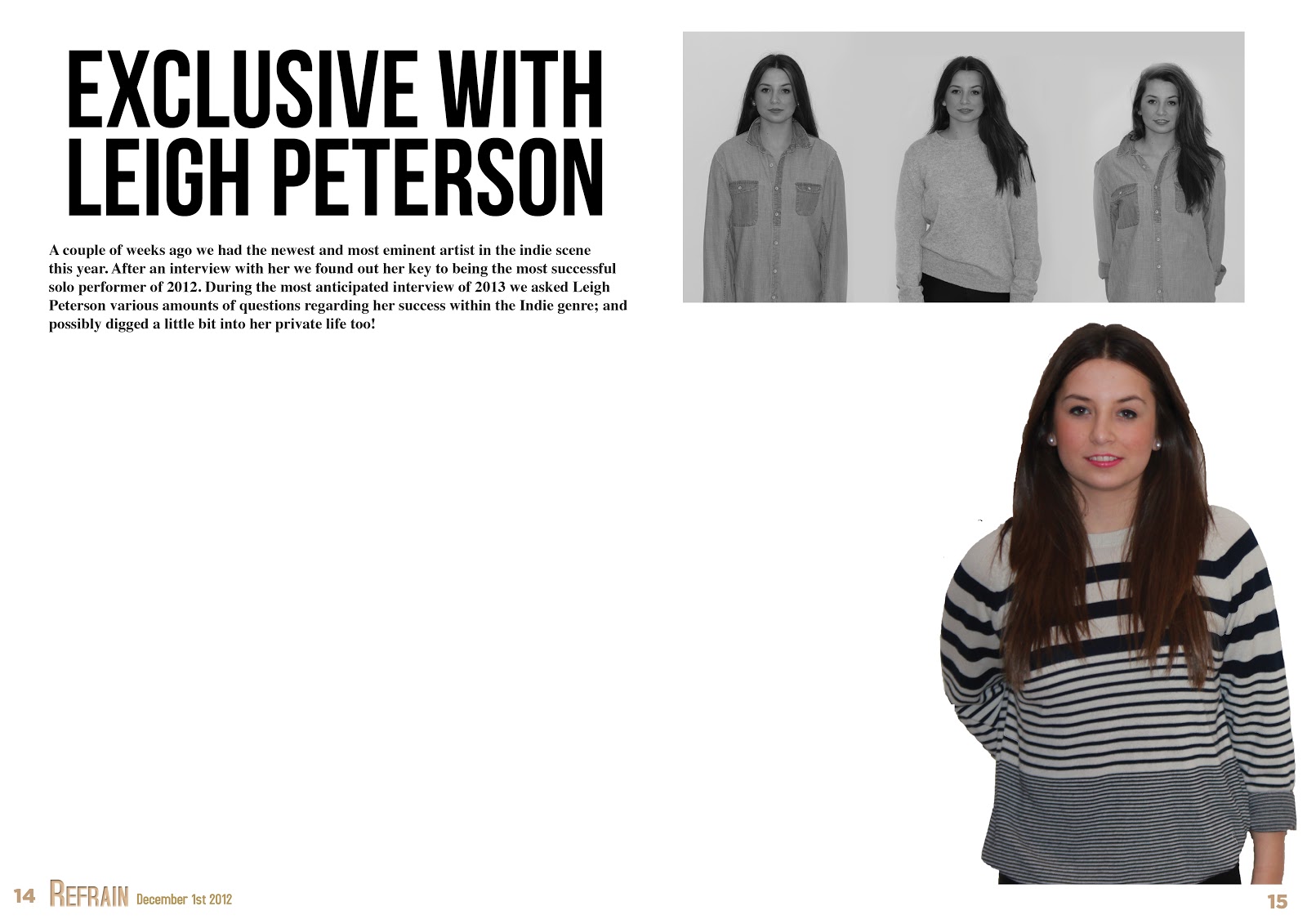
Above are the preliminary task media products and also my finished media products. As you can see, I have made significant improvements when utilizing photoshop and indesign; I have been able to improve because I have carried out significant research on existing media products which I did not do for my preliminary task. Although the two magazines above are for different target audiences the design elements remain under the same genre; I have increased the quality of these in my main task. 

Layout and Page Design
One major improvement I gained  from my preliminary task was the awareness of layout and page design, I had no awareness of existing magazines and what works well when creating my preliminary task. After lots of research on existing magazines and gaining my own knowledge I was able to create a higher quality main task with a better finish. 

Spacial Awareness with font etc
I also gained a lot of knowledge on the sizes of things; e.g. the font, I was unaware the sizing of a4 when editing it on screen when I first started. After practise and putting things into perspective I was more aware of the scale of the magazine by the time I completed my main task. E.g. having a title spreading across a double page spread will look enormous when printed.

More focused research 
As I continued to progress through my media project I knew what needed to be researched and what specific areas to be focusing on. I could then apply this tightly focused research into my own ideas to create a better magazine. I had barely any research completed for my preliminary task, so had to work purely off my own limited ideas.

Differentiating in language and content in the two magazines
Obviously, there is a difference in language and specific content between a school magazine and a music one, in a school magazine the language is predominately formal while the music magazine is the opposite. I was unaware of the informality within text in music magazines till I purchased a few and read through them; I could then use this information to write my own double page spread.
It goes without saying about the difference in content; The school magazine has school related content and the music magazine is filled with music related content. The only place I needed to show the different content was within the coverlines on the front page and in the contents page; I did not have to write the whole magazine. I did suitable research and planning regarding what content to place on my coverlines before I created the first draft of the front page.

The colouring aspects
In my preliminary task I based the colours of the magazine around the colours of my school logo.(To the right) But for my actual magazine I did a lot of in depth research into the colouring aspects for existing magazines, I found that most magazines use red, white, black and yellow for their front cover, I tried to incorporate these colours within my magazine to help further lure my target audience in. I had no awareness of my targets audience needs when doing my preliminary task so I only used the blue and yellow colours; if I was to re-do my preliminary with the knowledge I have now I would make sure I had done the proper research into exisiting magazines of its kind. This would allow me to strengthen the target audiences perspective on my magazine and get the readers. I made sure the colouring on my main task was extremely accurate because I was trying to sell the magazine and gain subscribers, unlike on my preliminary which was a free magazine for school.

Clearer view of house style
Although I was aware of the basics in a house style, I gained a greater knowledge on how to tightly follow the house style when doing my main task. I made sure the colour schemes followed on throughout my magazine (black and gold) to maintain the house style. I tried my best to maintain a house style in my preliminary task, but I did not achieve this because I did not have a large knowledge on how to at the time.


The feedback
When the preliminary task was completed we had no class feedback so I was unsure on what to change. We did extensive feedback for our main tasks on numerous occasions so we was always sure on what to improve and how we can improve these to create a higher quality main task. We did this feedback for the Front Cover, Contents and Double Page Spread, also I gave my magazines to members of my selected target audience so I could see what they would like to see.

What I would do differently next time
If I was to do the entire thing again, the main thing I would improve would be my time management. I was unaware of how long things would take at some points so occasionally I'd find myself working to tight deadlines instead of comfortably 'breezing' through. I would also possibly the genre of my magazine, purely because I found the 'indie scenester' scene hard to find solid information on when researching into my target audience.

Evaluation Question  6

What have you learnt about technologies through the process of constructing this product?

Throughout this entire product construction I have had to use various different software and online media creators to help aid good use of ICT and also produce the media product. Some of these software's and tools I was unaware of how to use so had to self teach myself to a certain extent.

The technologies I used are listed below;

  • Adobe Photoshop cs4 and cs6 - To create the Front Cover and Contents Page of my magazine.
  • Adobe Indesign - To create my Double Page Spread
  • Sony Vegas 11 - All my video productions 
  • Survey Monkey
  • Go Animate
  • AuthorSTREAM
  • Glogster
  • YouTube
  • Animoto
  • Canon 550D 28-108mm lens, and fixed 50mm lens- For the original images
  • Hama Star 61 tripod - Strengthening the shots
  • GoPro HD Hero - Capturing videos while I was using my dslr
  • Bandicam - Capture the screen
  • Apple Macs and Dell pc's 
  • Blogger
Photoshop
I used photoshop because it is a professional image editing software, which was firstly provided to us from school, but I purchased it myself to take my work home. It has many features that are rare in a lot of programmes and was the best software to use for the job in hand. I used photoshop for my Front Cover and Contents page.

Indesign
I used indesign because like photoshop its a very functional piece of software. It also has integration with photoshop too. I used this for my Double Page Spread because it has one tool that is not featured in photoshop, which is text wrapping. It made the job a lot easier to edit.

Sony Vegas 11
Is a software I purchased a while ago for personal home use so I was already pretty comfortable with it, I decided t edit my videos using this software.

YouTube
There are plenty of video uploading sites but I chose YouTube because it is well known and has full integration within Blogger, this integration with Blogger helps strengthen the good use of ICT within my media products.

Canon 550D
This is my personal camera that I used to take the original pictures for my magazine. I used this camera because it can take high quality images which can be blown up to the size of my magazine also, this was used with the Hama Star 61 Tripod to help stabilize the shots for higher quality pictures. The GoPro HD Hero, was used to video evidence that the picture were original.

Apple Macs & Dell PC's
I used these pieces of technology because these were available to me; at school we use the macs and at home I used my PC's. They both were capable in efficiently completing the task.

Blogger
We used Blogger, as our 'coursework folder' because it is highly interactive. We live in a digital age and it is a necessity to present information in different ways than just images and text; Blogger allows us to do this. Blogger has a great archiving system, allowing you easily to navigate through posts and locate whatever you want within seconds, rather than tediously scrolling through endless posts. Another, great bonus is that you can work from anywhere with an internet connection, no documents needed. Although, it has its cons, like the uneasy way of laying out images etc.

Presentation Devices
These are the pieces of software that can be fully integrated with Blogger for a heightened experience. They allow better ways of presenting data and are fully interactive, e.g. Glogster for viewing images.


This is my setup for my photoshoot, I also had a large light but I could not take a picture with this because the flare was interrupting the image. The tripod was used because it stabilizes the image and allows me to adjust the height of the image capturing and also the angle - as shown to the left. I could take various amounts of pictures with the camera pointing at exactly the same point while the model could change her stance or posture accordingly.


Below is a link to the photo shoot, showing the technology I used when taking my photos for the front cover etc. This is a link to the other videos I made showing me producing the first draft of my front cover and the tools I used in the process http://kaneboormanmedia.blogspot.co.uk/search/label/Front%20Cover%20Videos


Evaluation Question 5

How did you attract/address your audience?

I believe that my publication could exist as a real media product because it sometimes it closely follows the design elements from other magazines, especially NME; I believe the coverlines sound real, this is because of my extensive research I did into the coverlines when doing my magazine analysis. I believe the title is of a good standard because it has a catchy sound and also relates to musical elements too.


I believe the strongest elements within my media products are my contents and double page spread construction; I feel they look more professional than my front page. They clearly distinguish the genre of my magazine too, especially the double page spread because you can read the colloquial tone I use throughout my article; evident in most 'indie' magazines I have researched. I like my contents page because it is very similar to NME's (above) I did this because NME is a well respected and suitable magazine choice to base my designs around; I have changed a few elements although to get some unique selling points (UPS).

I do feel that the pictures I have included throughout my media products are relevant to the genre of the magazine. Although, to make a higher production value to my magazines I would try to take better quality pictures with the equipment I have; obviously they wouldn't be as high production as real media magazines because they have access to studios etc..

The features that would relate to other magazines is just the general layout of the magazine, the contents page as shown above is very similar to NME's but the double page spread is very uniquely created. It is fairly rare to find two front pages that are very similar to each other so my front cover is also quite unique in itself, I used certain aspects of coverlines though when I was doing my research into effective coverlines.

I would buy the magazine because it incorporates the genre of music that I like. I feel that this is also a better price than most other weekly magazines. Even though NME is similar genre of music, it has a more wide approach to the music industry; my genre is tightly focused on 'indie'.

On The Front Cover

To the left is my front cover. I included a few design elements and different cover lines in order to attract potential readers from my selected target audience. The main image is the first thing a potential will notice, or possibly the huge cover line overlaying the image; it is this big and this colour because it aims to lure the reader in, entices them to want more. Even though the other cover lines are smaller, they are still emboldened to attract the readers attention. In the top right I have included a chance to win a fender newporter; an item that my target audience would be interested in winning; this will make them purchase the magazine.


On The Contents Page


To the right is my final contents page. I included various design elements and sub-headings to attract my 'indie scenesters' but while doing this I also had to adhere to my unified house style; which I believe I have done. The title has been brought across to the contents which is still bold and stands out more with the contrasting background, 'this week' is the same size as the 'refrain' because I want it to be equally as important. The subheadings in the boxes are there to grab the readers attention and allow them to find information quickly. I have included a medium sized image and a mini article so it lures the reader into wanting more. I have also included a discount offer at the bottom, along with promoting 'the ultimate album of 2012'.


On The Double Page Spread

My final double page spread is below. The main way I have tried to attract the target audience is with the huge headline; 'Exclusive With Leigh Peterson.' The pull quote is also instantly noticed because it stands out and is in the gold colour, along with all the questions. There is a trilogy of the 'artist' as well as a bigger picture below that, all appropriatley wrapped around the text so the reader has no struggle reading it.

A video description below

Evaluation Question 4

Who would be the audience for your media product?


Above is a video I created using Sony Vegas 11 to answer this question, in the video I give examples of an 'indie scenester' and the specific target audience I was trying to attract when designing and producing the elements within my magazine production.


Wednesday 27 February 2013

Evaluation Question 3

What kind of media institution might distribute your media product and why?
The role of a magazine distribution is to produce and then dispatch your magazine to different sellers in your selected area of choice. They will distribute them to places where numbers of your target audience are most likely to purchase your magazine. The producers will also create all the major aspects of the magazine including the structure and the content. Although,  the companies themselves are in charge of creating the initial designs and copies of the magazine by editing all the images, writing all the text involved and also deciding which bands and music to include in their magazine, the publisher then works with this information given. The media institution I select will need to publish my media product (see right) and then distribute them to stores such as WHSmith and other newsagents where my target audience are likely to pick up the magazine; they would also be have to deal with the subscription and posting side of the magazine production.


My magazine is most similar to NME magazines. This is because my magazine follows the same genre and target audience that NME does, most of my design elements I haven't come up with myself are taken from the conventional NME magazine. If I was to do this again I would take some more ideas from Q magazines because they also follow the same genre of music as my magazine and it would greater my variety of magazine; I would also include some more of my own design ideas to help better my unique selling points (UPS

After researching I have found that Bauer Media Group would be most likely to produce and distribute my magazine; this is because IPC Media already produce and distribute NME magazines, my design closely follows this magazine so there would not be a gap in the market for my magazine - it would not be worth IPC's time.

All these magazines have similar design ideas and formatting layout to mine; I chose the best bits out of each of these magazines and incorporated them within my design ideas. If I was to do this again I would include a bit more from the NME but also come up with some more unique selling points (USP) to propose something fresh and new to the Bauer Media Group.

Bauer Media Group offers over 300 magazines in 15 countries, as well as online, TV and radio stations. Bauer Media is a UK based media Group that contains lots of different companies that focus around Magazines and Radio, they are recognized globally as being very successful and innovative with their work.


Obviously here I have tried to incorporate some of the design ideas evident on the edition of NME to the left. I have included my own design ideas such as the layout of text and the actual content of text on my front page. Instead of an abbreviated title for a magazine I have used an actual word - this is rare for
music magazines so it is a unique selling point (UPS.) To improve I would try to get a stronger picture because I  think mine is weak but also incorporate more of my own design ideas to my front page.
To either sides are a Q magazine and a Kerrang! magazine, they don't look anything like my magazine because this is an anomalies to the normal magazine Bauer Media Group will produce. The genre and target audience for Kerrang! are totally different to that of my magazine so I used barely  used any design ideas or formatting options from this magazine. 


I looked into certain gaps in the media institutions. I would not suppose an institution with 3 similar products would seek to find another one. I chose Bauer Media Group because they do not publish an 'indie scenester' magazine so they might be interested in publishing my magazine. With this gap it opens more opportunities for Bauer to receive a higher revenue stream.

I also took into consideration the circulation figures from these three magazines and their publishers;


NME (IPC Media) -23,924
Q (Bauer Media Group)- 64,596
Kerrang! (Bauer Media Group) -40,203

Q clearly has the highest circulation figures so Bauer must be doing something right! I want to send my magazine with a publisher that manages to distribute the magazines efficiently and well - Bauer Media Group proves to do this with Q and Kerrang!


Saturday 23 February 2013

Evaluation Question 2

How does your media product represent particular social groups?

Below is the difference in my picture I selected for my CD cover and a picture from the internet of my selected target audience; 'indie scenester.'

Although the structure and stance of the two pictures are different; there are similar attributes of the two. As evident, the lighting in both pictures are very similar, it was obviously dark when both pictures were taken and an artificial flash is apparent, this gives an 'indie' feel to the magazine. Also what type of clothing everyone is wearing is similar. Both subjects on the right are wearing shorts and low cut shoes while on the right they're all wearing trousers. Even though any of them may not be pulling a pose; this is because the picture was being used for a CD cover so a front cover 'pose' was not required, the setting allows the picture to look natural and not set up. The angles of both pictures are at eye line level and the expression on all the faces are similar, they show a distant emotion with a mysterious feel.


To the left is the NME birthday edition feel I was going for when creating my magazine. As you can see the main subject in both mine and the NME magazine is situated slightly to the right and owns the page. The rest of the covers are filled with minimal text and the font is small and thin. The NME cover, the arctic monkeys all have an emotionless expression and I tried to copy this emotionless feel with my model. Although I have taken a mid shot rather than a full body shot like NME I still feel that the subject overwhelms the page completely. As the Arctic Monkeys are the main coverage story within that edition of NME, Leigh Peterson is my focus throughout my magazine. I tried best to include the gold feel within my fonts but I could not succeed because the gold shine is only possible when printed, to whom of which mine isn't. Although my model is a female, the clothes she is wearing are similar to those in the Arctic Monkeys; this will help attract my specified target audience and further justify my genre choice.


To the left is the picture I chose for my front cover, it represents the 'indie scenester' group because of the denim shirt and minimal make up as shown below. Even though the picture below was obviously taken in the street and not against a white wall it still depicts the target audience I was aiming for when taking my picture. The stance of the pictures are not the same but the mise en scéne of the clothes are practically the same, along with the minimal make up.

Evaluation Question 1

 In what ways does your media product use, develop or challenge forms and conventions of real media products?


In my media products I decided to incorporate various parts of all of the major music magazines into my magazine; I chose the parts I felt were best for my target audience. I also challenged some of the different styles of magazines in mine and tried to create my own unique selling point (UPS). I mainly looked at the magazines 'NME,' 'Q' and 'Kerrang!,' one thing I found during my research into these magazines is although they have very different layouts, their colouring is very similar; red, white and yellow. See my research on colouring to the right.

I tried to incorporate these conventional colours into my magazine design, although instead of yellow I used a slightly golden colour to give my magazine a unique selling point. I also kept the title to the top left like the rest of the magazines I researched - I did not see a title anywhere else on the page while researching into these.


Front Page 

My first intentions for my front cover, the NME magazine I initially chose to base the layout and structure of my front page. I liked this magazine because it has a certain minimalist view to it, it also has very thin font which I tried to incorporate into my first draft of a front cover. Also I tried my best to use the gold font colouring in my front cover but I could not create the gold 'shine' that appears on this edition on Photoshop CS4. 


Although, I do not follow the same cover line structuring as what I originally was going to go for, I tried to make my final design as strongly tailored to my target audience as possible. I know that my final design is better tailored because I created a survey for people that fall into my specified target audience and a rare few preferred my first draft. I decided to use my final draft because it looks more professional and the picture shows more character.

From extensive research it became obvious to me that the 'artist' on the front cover on the magazine should not appear to be standing in front of a wall. They need to show 'character' or a personality within their body language and facial expression, this is so the potential reader may build a rapport with the image and want to read on.


I then chose the title of my magazine by selecting a range of different titles and then conducted a survey with the chosen titles to see which title came out with the highest rating; obviously this title was 'Refrain.'
I only surveyed people from within my specified target audience, this helps to decrease bias' viewpoints and also helps to validate the data acquired.


Although the main image on my front cover was fully illuminated when capturing the picture, I have added a darker layer to the top of the image, this creates the effect of the image as if it had been printed, on most magazines the paper used dulls down the images slightly.


Not just on the front cover, but the images throughout I have tried giving them an 'indie scenester' feel. This has been achieved through the use of the costumes given to the models. The denim shirt is not so indie, but the way it is worn is very 'individual'. Wearing the shirt very loosely and messily adds attitude and character to the fictional artist portrayed by the model. The shirt itself is a mens shirt so also adds the boundaries pushed by the female artist.

I chose not to use any props on my main image because I thought that using these would steer away my selected target audience; although if I was to re-visit this again and re-do the front cover I would definitely give the subject a prop because it will entice the readers to read on, it will also get their attention in the first place. 


Above is a comparison between my magazine front cover and two NME covers. If I was to re-do my cover I would definitely take a better picture, I believe that my front cover picture lets down my front cover entirely. With a better picture I could format the text and justify it more appropriately around the subject like the other two magazine examples above. My picture is considerably darker than most conventional media magazines; the artificial lighting I used was not sufficient enough for my needs. I also may have needed to enlarge the subject of my front cover so that she becomes the main focus point to lure the readers in.


Contents Page


Above are a selection of NME contents pages, and my final contents page centered in between them. When designing my own contents page I closely followed the design of NME but also incorporated my own ideas or adapted them when needed. As you can see from each NME contents page; there is a band index on the left, I did not include this in my magazine because the size of my page is A4, while NME print slightly wider, so have the ability to include this. Although, this is a unique selling point of my magazine; there are not a lot of contents pages out there with two columns as opposed to three.


Another unique selling point I tried to create in my magazine is the colouring; although the formatting of the magazine is roughly the same, I chose to use different colours. The colours I chose help fortify a unified house style and the 'golden' colour helps entice someone in my target audience into reading my magazine.


Either side are the two drafts of my contents page. On the left is the first draft, which as you can see doesn't have enough pages and there is too much white space. The draft to the right is the final draft; I added more page numbers and changed some of the design elements to improve the quality and validity of my magazine. In the vast majority of NME magazines they include a special subscription promotion in the bottom left corner of their contents page - I decided to redesign my own version of this concept and place it within my design because I believe it's a great way of keeping a reader inside the magazine. I rearranged the album artwork and design elements in the bottom right of the contents page so it looks more professional and will appeal further to the target audience of my magazine. I also cut down the white space surrounding the text and design elements on my contents page because when researching it was rare to find a contents page with a lot of white space, it is not spacially efficient to do this.

Double Page Spread


Instead of using Adobe Photoshop CS4 as I did for my Front Cover, and Contents Page, I used Adobe Indesign for the construction of my Double Page Spread. I used this piece of software because it is has a text wrapping feature, it also works double with Photoshop; any changes you make in Photoshop will automatically appear in Indesign.


My first and final draft for my double page spread is below

Even though the films strip of three pictures is rare, I decided to use it as a unique selling point. The huge headline 'Exclusive with Leigh Peterson' is designed to stand out and grab the readers attention. I chose to structure my double page spread as questions and answers, as this is very popular in the music magazines relevant to my selected genre. The pull quote is large and of a different colour to help lure the readers in before they even start to read the article.

All text is formatted appropriately around any images or text and this wrapping was done through Indesign. I used a drops cap in the first part of the questions because this is also evident in the majority of music magazines; regardless of their genre.

I believe that this double page spread is not a conventional one because it features 4 pictures instead of the usual 1. The background is all white which is also a rarity in normal double page spreads, they usually include the background of the original image, I have cut out my subject from the original background so I can wrap the text around appropriately. 

I gained knowledge on how to write the actual double page spread first draft through reading other conventional music magazines. Doing this gave me a better idea on how they are structured and the prose used, I found through my research that the vast majority of double page spreads are interviews with the chosen artist. I decided to do this with my double page spread and I tailored the answers around the genre of music I chose to base my magazine on so they would better suit the target audience of my magazine.

Although these are not entirely similar, to the left is the design that I based my double page spread around, while incorporating my own ideas and different ideas from other magazines. I have similar elements from the double page spread on the left, for example the main image in colour and a film strip of black and white images that fade into one another. The double page spread to the left doesn't have some of the design elements feature in mine, like text wrapping around images and pull quotes, or drops caps.

I used drops caps because they are used in the vast majority of articles in any magazine not just music magazines. It signify's the start of the article and is just a well known design element, especially for double page spreads in the music industry.


I also used my pull quote because it is bold and will appeal to the reader, Pull quotes are used in a lot of music magazine double page spreads because they stand out and appeal to the readers. I situated mine in the middle of my text and text wrapped around it because it is most likely to stand out to readers this way.


Thursday 14 February 2013


 Possible version 2 of Front cover (Not completed)


Final Draft

Wednesday 13 February 2013

Double Page Spread First Draft


Double Page Spread Construction

Firstly I opened a document on Indesign, I selected A3 size and then included six columns as you can see to this side. These columns would act as dividers between my text. I then added a headline to my page.


I then added the headline to the page by simply holding CMD and V on the keyboard, I can then adjust the placement of the headline using the mouse. I could change the font and text of the headline using the text adjustment tool (see left).

Below is the headline added to the document.
When doing research I found that usually in double page spreads there is a small introduction before the interviewer gets on with the question and answers section, so I included my own, directly below the big headline. This is too introduce Leigh to the audience before they find out her real personality through Q&A. The text was placed in this position by using the mouse to drag it as before. Also I changed the size and font of the text by using the text tool as previously mentioned.
Too add a unique selling point (UPS) to my magazine I decided to add a picture featuring three of Leigh in it. The backgrounds all fade into each other so it looks like one picture with three of her; this is not my main image but it adds a bit of character to the double page spread. This was made using photoshop by dragging the three pictures into a line and exporting this as a jpg, this jpg was then 'placed' into my Indesign document, it was then adjusted using the mouse. Below to the right is the outcome.


I then added the main image. I cropped it out using the quick selection tool in Adobe Photoshop CS4, I then copied and pasted it into indesign and adjusted the size and placement of it using the mouse.


After this I added page numbers and also 'Refrain' and the issue number to the bottom of my page for brand identity. I typed the text using the text tool as mentioned before, I also changed the colour of the text this way too.


I then added all the text to my double page spread with the text wrap tool as said before, I changed some the colouring of some of the text using the font tool. The gaps between the text articles were determined using the six guidelines I added originally to the document. My first and final draft is to the right.