Evaluation Question 3
What kind of media institution might distribute your media product and why?
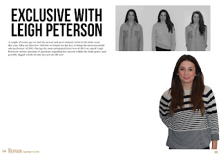
 The role of a magazine distribution is to produce and then dispatch your magazine to different sellers in your selected area of choice. They will distribute them to places where numbers of your target audience are most likely to purchase your magazine. The producers will also create all the major aspects of the magazine including the structure and the content. Although, the companies themselves are in charge of creating the initial designs and copies of the magazine by editing all the images, writing all the text involved and also deciding which bands and music to include in their magazine, the publisher then works with this information given. The media institution I select will need to publish my media product (see right) and then distribute them to stores such as WHSmith and other newsagents where my target audience are likely to pick up the magazine; they would also be have to deal with the subscription and posting side of the magazine production.
My magazine is most similar to NME magazines. This is because my magazine follows the same genre and target audience that NME does, most of my design elements I haven't come up with myself are taken from the conventional NME magazine. If I was to do this again I would take some more ideas from Q magazines because they also follow the same genre of music as my magazine and it would greater my variety of magazine; I would also include some more of my own design ideas to help better my unique selling points (UPS
After researching I have found that Bauer Media Group would be most likely to produce and distribute my magazine; this is because IPC Media already produce and distribute NME magazines, my design closely follows this magazine so there would not be a gap in the market for my magazine - it would not be worth IPC's time.

 Obviously here I have tried to incorporate some of the design ideas evident on the edition of NME to the left. I have included my own design ideas such as the layout of text and the actual content of text on my front page. Instead of an abbreviated title for a magazine I have used an actual word - this is rare for
music magazines so it is a unique selling point (UPS.) To improve I would try to get a stronger picture because I think mine is weak but also incorporate more of my own design ideas to my front page.

 To either sides are a Q magazine and a Kerrang! magazine, they don't look anything like my magazine because this is an anomalies to the normal magazine Bauer Media Group will produce. The genre and target audience for Kerrang! are totally different to that of my magazine so I used barely used any design ideas or formatting options from this magazine.
I looked into certain gaps in the media institutions. I would not suppose an institution with 3 similar products would seek to find another one. I chose Bauer Media Group because they do not publish an 'indie scenester' magazine so they might be interested in publishing my magazine. With this gap it opens more opportunities for Bauer to receive a higher revenue stream.
I also took into consideration the circulation figures from these three magazines and their publishers;
What kind of media institution might distribute your media product and why?
 The role of a magazine distribution is to produce and then dispatch your magazine to different sellers in your selected area of choice. They will distribute them to places where numbers of your target audience are most likely to purchase your magazine. The producers will also create all the major aspects of the magazine including the structure and the content. Although, the companies themselves are in charge of creating the initial designs and copies of the magazine by editing all the images, writing all the text involved and also deciding which bands and music to include in their magazine, the publisher then works with this information given. The media institution I select will need to publish my media product (see right) and then distribute them to stores such as WHSmith and other newsagents where my target audience are likely to pick up the magazine; they would also be have to deal with the subscription and posting side of the magazine production.
My magazine is most similar to NME magazines. This is because my magazine follows the same genre and target audience that NME does, most of my design elements I haven't come up with myself are taken from the conventional NME magazine. If I was to do this again I would take some more ideas from Q magazines because they also follow the same genre of music as my magazine and it would greater my variety of magazine; I would also include some more of my own design ideas to help better my unique selling points (UPS
After researching I have found that Bauer Media Group would be most likely to produce and distribute my magazine; this is because IPC Media already produce and distribute NME magazines, my design closely follows this magazine so there would not be a gap in the market for my magazine - it would not be worth IPC's time.
All these magazines have similar design ideas and formatting layout to mine; I chose the best bits out of each of these magazines and incorporated them within my design ideas. If I was to do this again I would include a bit more from the NME but also come up with some more unique selling points (USP) to propose something fresh and new to the Bauer Media Group.
Bauer Media Group offers over 300 magazines in 15 countries, as well as online, TV and radio stations. Bauer Media is a UK based media Group that contains lots of different companies that focus around Magazines and Radio, they are recognized globally as being very successful and innovative with their work.

 Obviously here I have tried to incorporate some of the design ideas evident on the edition of NME to the left. I have included my own design ideas such as the layout of text and the actual content of text on my front page. Instead of an abbreviated title for a magazine I have used an actual word - this is rare for
 music magazines so it is a unique selling point (UPS.) To improve I would try to get a stronger picture because I think mine is weak but also incorporate more of my own design ideas to my front page.

 To either sides are a Q magazine and a Kerrang! magazine, they don't look anything like my magazine because this is an anomalies to the normal magazine Bauer Media Group will produce. The genre and target audience for Kerrang! are totally different to that of my magazine so I used barely used any design ideas or formatting options from this magazine.
 I looked into certain gaps in the media institutions. I would not suppose an institution with 3 similar products would seek to find another one. I chose Bauer Media Group because they do not publish an 'indie scenester' magazine so they might be interested in publishing my magazine. With this gap it opens more opportunities for Bauer to receive a higher revenue stream.
I also took into consideration the circulation figures from these three magazines and their publishers;
NME (IPC Media) -23,924
Q (Bauer Media Group)- 64,596
Kerrang! (Bauer Media Group) -40,203
Q clearly has the highest circulation figures so Bauer must be doing something right! I want to send my magazine with a publisher that manages to distribute the magazines efficiently and well - Bauer Media Group proves to do this with Q and Kerrang!


