Evaluation Question 1
In what ways does your media product use, develop or challenge forms and conventions of real media products?
 In my media products I decided to incorporate various parts of all of the major music magazines into my magazine; I chose the parts I felt were best for my target audience. I also challenged some of the different styles of magazines in mine and tried to create my own unique selling point (UPS). I mainly looked at the magazines 'NME,' 'Q' and 'Kerrang!,' one thing I found during my research into these magazines is although they have very different layouts, their colouring is very similar; red, white and yellow. See my research on colouring to the right.
I tried to incorporate these conventional colours into my magazine design, although instead of yellow I used a slightly golden colour to give my magazine a unique selling point. I also kept the title to the top left like the rest of the magazines I researched - I did not see a title anywhere else on the page while researching into these.

Front Page


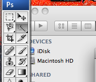
My first intentions for my front cover, the NME magazine I initially chose to base the layout and structure of my front page. I liked this magazine because it has a certain minimalist view to it, it also has very thin font which I tried to incorporate into my first draft of a front cover. Also I tried my best to use the gold font colouring in my front cover but I could not create the gold 'shine' that appears on this edition on Photoshop CS4.
Although, I do not follow the same cover line structuring as what I originally was going to go for, I tried to make my final design as strongly tailored to my target audience as possible. I know that my final design is better tailored because I created a survey for people that fall into my specified target audience and a rare few preferred my first draft. I decided to use my final draft because it looks more professional and the picture shows more character.
From extensive research it became obvious to me that the 'artist' on the front cover on the magazine should not appear to be standing in front of a wall. They need to show 'character' or a personality within their body language and facial expression, this is so the potential reader may build a rapport with the image and want to read on.

I only surveyed people from within my specified target audience, this helps to decrease bias' viewpoints and also helps to validate the data acquired.
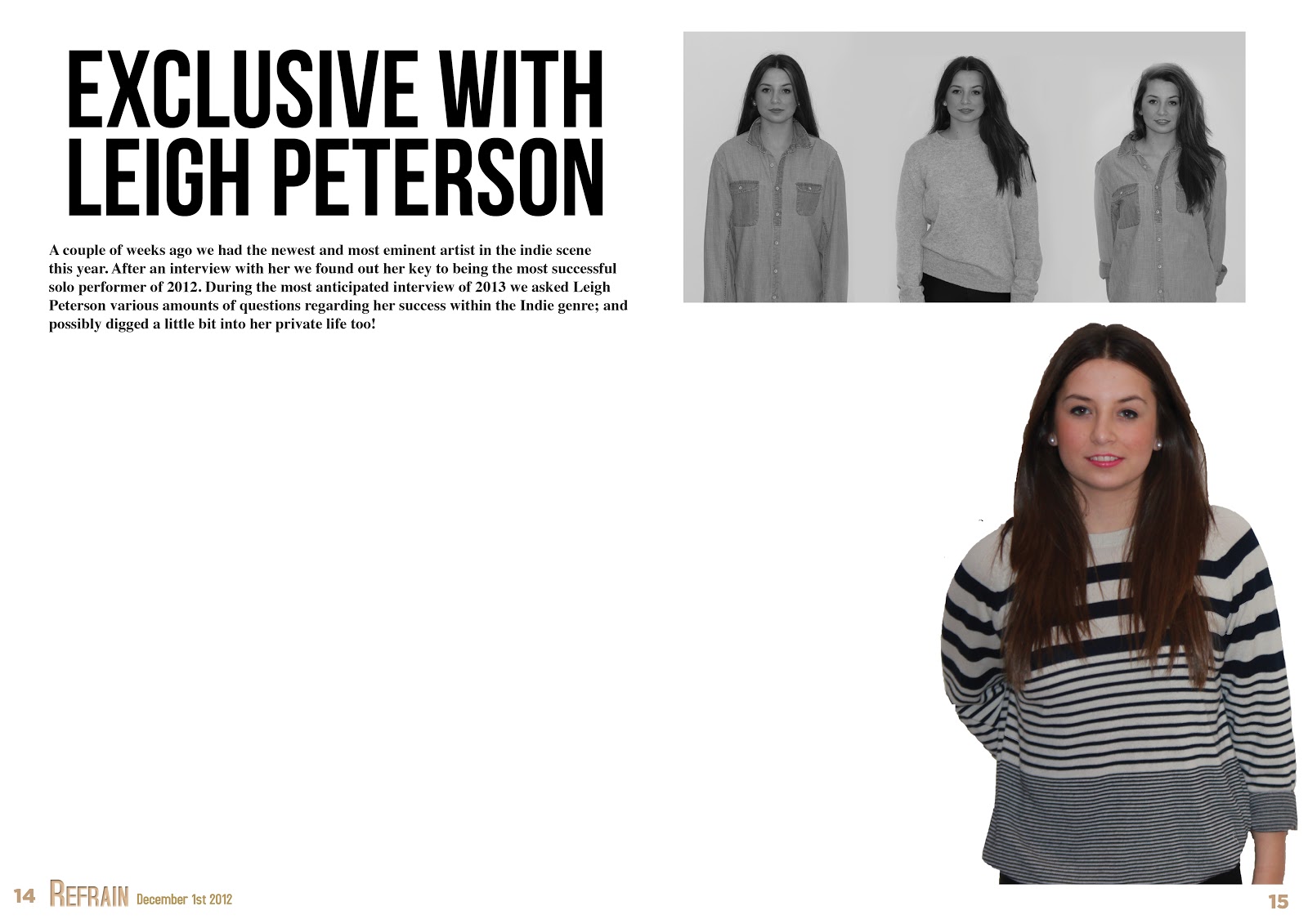
 Not just on the front cover, but the images throughout I have tried giving them an 'indie scenester' feel. This has been achieved through the use of the costumes given to the models. The denim shirt is not so indie, but the way it is worn is very 'individual'. Wearing the shirt very loosely and messily adds attitude and character to the fictional artist portrayed by the model. The shirt itself is a mens shirt so also adds the boundaries pushed by the female artist.
I chose not to use any props on my main image because I thought that using these would steer away my selected target audience; although if I was to re-visit this again and re-do the front cover I would definitely give the subject a prop because it will entice the readers to read on, it will also get their attention in the first place.

Above is a comparison between my magazine front cover and two NME covers. If I was to re-do my cover I would definitely take a better picture, I believe that my front cover picture lets down my front cover entirely. With a better picture I could format the text and justify it more appropriately around the subject like the other two magazine examples above. My picture is considerably darker than most conventional media magazines; the artificial lighting I used was not sufficient enough for my needs. I also may have needed to enlarge the subject of my front cover so that she becomes the main focus point to lure the readers in.
Contents Page

Above are a selection of NME contents pages, and my final contents page centered in between them. When designing my own contents page I closely followed the design of NME but also incorporated my own ideas or adapted them when needed. As you can see from each NME contents page; there is a band index on the left, I did not include this in my magazine because the size of my page is A4, while NME print slightly wider, so have the ability to include this. Although, this is a unique selling point of my magazine; there are not a lot of contents pages out there with two columns as opposed to three.
Another unique selling point I tried to create in my magazine is the colouring; although the formatting of the magazine is roughly the same, I chose to use different colours. The colours I chose help fortify a unified house style and the 'golden' colour helps entice someone in my target audience into reading my magazine.


Either side are the two drafts of my contents page. On the left is the first draft, which as you can see doesn't have enough pages and there is too much white space. The draft to the right is the final draft; I added more page numbers and changed some of the design elements to improve the quality and validity of my magazine. In the vast majority of NME magazines they include a special subscription promotion in the bottom left corner of their contents page - I decided to redesign my own version of this concept and place it within my design because I believe it's a great way of keeping a reader inside the magazine. I rearranged the album artwork and design elements in the bottom right of the contents page so it looks more professional and will appeal further to the target audience of my magazine. I also cut down the white space surrounding the text and design elements on my contents page because when researching it was rare to find a contents page with a lot of white space, it is not spacially efficient to do this.
Double Page Spread
 Instead of using Adobe Photoshop CS4 as I did for my Front Cover, and Contents Page, I used Adobe Indesign for the construction of my Double Page Spread. I used this piece of software because it is has a text wrapping feature, it also works double with Photoshop; any changes you make in Photoshop will automatically appear in Indesign.
My first and final draft for my double page spread is below

All text is formatted appropriately around any images or text and this wrapping was done through Indesign. I used a drops cap in the first part of the questions because this is also evident in the majority of music magazines; regardless of their genre.
I believe that this double page spread is not a conventional one because it features 4 pictures instead of the usual 1. The background is all white which is also a rarity in normal double page spreads, they usually include the background of the original image, I have cut out my subject from the original background so I can wrap the text around appropriately.
I gained knowledge on how to write the actual double page spread first draft through reading other conventional music magazines. Doing this gave me a better idea on how they are structured and the prose used, I found through my research that the vast majority of double page spreads are interviews with the chosen artist. I decided to do this with my double page spread and I tailored the answers around the genre of music I chose to base my magazine on so they would better suit the target audience of my magazine.


 I used drops caps because they are used in the vast majority of articles in any magazine not just music magazines. It signify's the start of the article and is just a well known design element, especially for double page spreads in the music industry.

 I also used my pull quote because it is bold and will appeal to the reader, Pull quotes are used in a lot of music magazine double page spreads because they stand out and appeal to the readers. I situated mine in the middle of my text and text wrapped around it because it is most likely to stand out to readers this way.