Contents page Construction 2
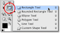
To the left I started a new document. Within this document I placed a black rectangle using the shape tool as situated below; I then adjusted it to whatever size I wanted.

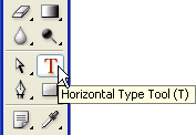
 In addition to this I then added text to my rectangular banner I had just added; this was done using the text tool to the left.
Then I decided to add a picture from one of my photoshoots to my contents; It is situated here because it is similar to the layout of NME; same applies with the black and white. I simply dragged this image in from the computer

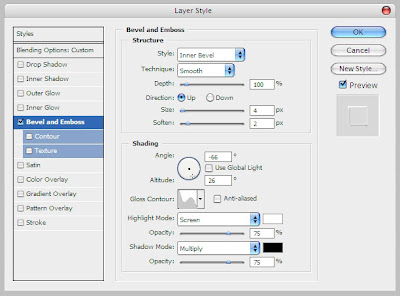
I then added the 'Refrain' Logo to the banner at the top; I extended the banner by drawing another rectangle using the same tool as before. The 'Refrain' text was added using the text tool but I added some effects to it. I used bevel and emboss, and also the gradient overlay; both these effects can be found on the drop out menu below.

 I then added my written mini article below the picture; this was done with the text tool as before, obviously with a bigger amount of text. I did create the T in the first word to be bigger though, because through my research into contents pages it is evident that the majority of all major magazines do this.
 To give a design feel to my contents page I decided to use white rectangles to cover the bottom of my picture slightly so I could type across them. The rectangles were created using the rectangle tool and the text was created and edited using the text tool. (Both below)
Because before the top banner was too low down the page, I shifted it all up to the top to make it fulfil the page more. I also added a date below 'Refrain', I created another black rectangle so I could write over it in a white colouring; helps stick to the house style. The text was once again edited using the text tool.
After this I then began to add the banners to the right of my contents page. I started by using a black rectangle then writing 'NEWS' over it in a new font in white. I created an edited the text by using the Photoshop text tool. I also change the font of the 'this week' to add to the house style of my magazine.
I then began to add some of the page numbers into the different subheadings. I created the page number in a different text colour to match the 'Refrain' adding to the house style. The rest was then typed in a black font using the text tool.
I then continued to add the different sub headings and text to the contents page using the same tools as before.
After this I made a separate 'CD Cover' on Photoshop. I used an original picture of mine to create an effective 'CD Cover' to give the reader an insight to 'the ultimate album of 2012'. I then imported this file by saving it as a jpeg image and simply dragging it into the contents page Photoshop file.
After completing my First Draft I decided to act on the faults which I found, below are the adjustments I made to my magazine Contents Page.
I have chosen to create a subscription bar down in the bottom of my contents; this is evident in the NME style magazines. So far I used the rectangle tool to create the box to which the information will go into. I then imported a .jpg image of my front cover and tilted it at an angle using the mouse.
 After that I then incoporated all the text, I decided to keep the colour of the text similar to that which is on the page, this helps maintain the house style to the magazine. I done this using the text tool.
  I then decided to change the sub-heading 'other' to 'features' I feel this is a more suited sub- heading for a music magazine. I also temporarily changed the size of text for the mini-article.
As well as changing the sub-headings I added one more, making it seem more like a music magazine, it includes more pages and more detail.
After this I started to play around with the sizing of the subscription banner and also the CD cover size and 'the ultimate album of 2012,' I did this because I didn't understand how large these would be if they were actually printed onto a real magazine, all the adjustments were made by clicking cmd and t. I also added a 'plus' which will feature more sub-headings below that.
After that I added the 'plus' sub-headings I was going to incorporate earlier- these fufil the magazine more and give it a better feel.
For the final adjustments I made the text in the mini article a little bit larger and juxtaposed everything on the contents so it is align to a certain extent. I tried to heighten the production value of my contents page. All these adjustments were done using the transform shortcut; cmd and t.
I then decided I didn't like the bottom right design element so I changed it to better fit my house style. I also added a page number to my contents page and adjusted the spacing issues.


No comments:
Post a Comment